Alert fatigue and the economics of interruption
An override rate is usually read as a statement about the people overriding. It is more reliably read as a statement about the alert.
Writing on the design of clinical software

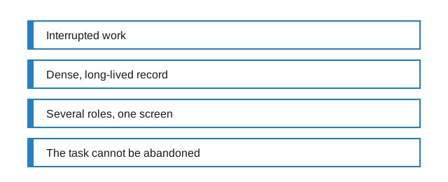
It is common to hear that clinical software is badly designed, and less common to hear a precise account of what makes it difficult. The difficulty is not that the people who build it are careless. It is that four constraints, each individually manageable, arrive together and interact badly.
Most software is designed for someone sitting down to do one thing. Clinical software is designed for someone doing four things at once, on a record that outlives every version of the program that has ever displayed it.
Continue reading this entry → Single entries open in a full-width reading column with the sidebar dropped.
An override rate is usually read as a statement about the people overriding. It is more reliably read as a statement about the alert.
Adding a field is the cheapest thing a stakeholder can ask for and one of the most expensive things a system can absorb. The cost is real, recurring, and paid by someone who was not in the meeting.
A number on a clinical screen is never just a number. It arrives with a unit, a scale, a source and a history, and the interface decides how many of those the reader gets to see.
Aside
Two screens can present exactly the same data and differ entirely in how long it takes to answer a question from them. That difference is the whole subject of this site, and it is almost never visible in a feature list or a specification.
Quote
The measure of a record is not how much it holds. It is how quickly the next reader finds the one thing they came for.
A working maxim for this site, not a quotation from anyone.