
Why clinical interfaces are hard to design
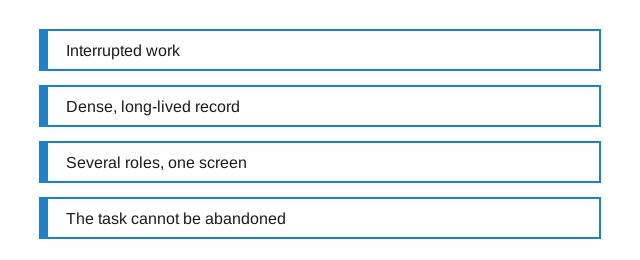
It is common to hear that clinical software is badly designed, and less common to hear a precise account of what makes it difficult. The difficulty is not that the people who build it are careless. It is that four constraints, each individually manageable, arrive together and interact badly.
The work is interrupted by default
Most interface conventions assume a user with a task and the intention to finish it. A great deal of interaction design is built on that assumption: progressive disclosure, multi-step flows, wizards, confirmation at the end. All of them degrade when the person using them is interrupted, and in clinical settings interruption is not an edge case. It is the normal texture of the shift.
This has a direct consequence for layout. A screen that requires the user to hold context in their head between steps is a screen that will be re-entered from cold, repeatedly. The design question stops being how to guide someone smoothly from start to finish, and becomes how to make an unfinished task legible to the person who returns to it eleven minutes later.
The record is dense and it outlives the software
A record accumulates for decades. It contains entries made in systems that no longer exist, under conventions that have changed, by people using vocabularies that have been revised since. The interface that displays it has to render all of that as though it were one coherent document, and it cannot decline to show the parts that do not fit its model.
Consumer software gets to define its own data. Clinical software mostly inherits it. That is why so many screens look like tables of tables: the display is trying to be honest about material it did not shape, and honesty about messy material tends to look like density.
Several roles share one surface
A single screen is often the working surface for people with genuinely different tasks. One is scanning for a change since yesterday. One is entering something. One is checking whether a thing was done. One is reading the whole thing for the first time. These are not personas in a research deck; they are four different information needs pointed at the same pixels within the same hour.
The usual resolution - build a separate view per role - runs into the fact that people move between roles constantly, and that a view someone cannot find is a view that does not exist. So the screen compromises, and a compromise between four needs reads as a screen that serves none of them especially well.
The task cannot be abandoned
In most software, a user who finds a flow annoying leaves. That is the feedback mechanism the whole discipline is calibrated on: friction produces abandonment, abandonment produces a metric, the metric produces a fix. Clinical software has no such mechanism. The work has to be completed regardless, so friction produces a workaround instead of a signal.
Workarounds are the real usability data in these systems, and they are largely invisible to the people who could act on them. A field that is always filled with the same meaningless value, a step performed on paper and transcribed later, a screen everyone has learned to reach by an undocumented keyboard route - each of these is a defect report that never got filed.
What follows from this
None of these constraints is a reason to accept a bad screen. They are a reason to be sceptical of design advice imported wholesale from software with different physics. Shorter is not automatically better if the omitted material is the material someone came for. Fewer clicks is not automatically better if the clicks were the thing that made an irreversible action feel irreversible.
The useful questions are narrower and duller. What does this screen look like to someone returning to it mid-task? What does it do with data it was not designed to receive? Which of its fields is anybody actually reading? Most of the writing on this site is an attempt to take one of those questions at a time.