
Data entry, forms and the cost of a field
Forms are where clinical software spends most of its interaction budget, and where its reputation is mostly made. They are also where the gap between the person requesting data and the person supplying it is widest.
A field is a recurring tax
The cost of a field is not the cost of building it. It is the cost of every completion of it, multiplied by everyone who completes it, for as long as it exists. A field that takes four seconds and is completed by a few hundred people several times a day is a substantial ongoing expenditure of attention, and it is charged to a budget nobody reports on.
This asymmetry explains a lot of otherwise puzzling interface decay. The person who wants the data gains from having it; the person entering it bears the cost; and there is rarely a mechanism through which the second informs the first. Fields therefore accumulate for the same reason alerts do.
Structured and free text are not rivals
The argument between structured fields and free text is usually framed as a choice, and it is usually not one. Structure is what makes material retrievable, comparable and countable. Free text is what makes it possible to record the thing that the structure did not anticipate, which is a category that never empties.
The failure mode is forcing structure onto material that is genuinely unstructured, which produces confident-looking data that means nothing, because everyone selected the least wrong option from a list that did not contain the right one. The opposite failure - free text everywhere - produces a record that can be read but not used. Most well-built forms structure the small stable core and leave room beside it.
Defaults are decisions someone else made
A pre-filled value is not a convenience; it is a prediction, and it will be accepted far more often than it is examined. That makes defaults among the most consequential design choices in a form, and they are frequently set by whichever value was easiest to compute.
A reasonable rule is that a default is appropriate where the value is genuinely almost always the same and the consequence of an unnoticed wrong value is small. Where either condition fails, an empty field that must be answered is safer than a filled one that will be skipped.
Required fields and the escape hatch
Marking a field required is often the first response to incomplete data, and it reliably produces complete data of lower quality. When someone genuinely does not have the value, and the form will not proceed without one, they will supply something. The system records that something as a fact.
Forms that hold up better tend to offer an explicit way to say that the value is unavailable, and to record that as its own state rather than collapsing it into a number. Unknown is information. A zero standing in for it is misinformation with the same shape as data.
Labels, hints and error copy
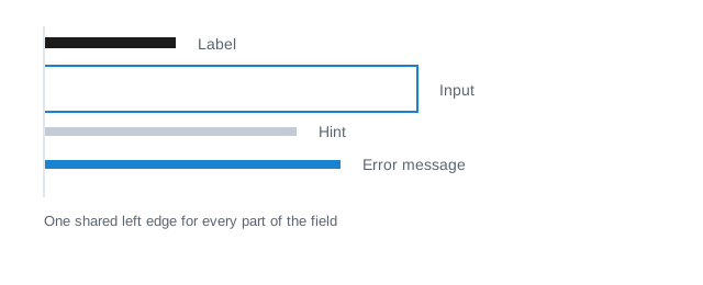
Label above the field, hint below the label, error below the field, all sharing one left edge: this arrangement is unglamorous and it survives contact with zoom, translation, narrow screens and screen readers better than the alternatives. Placing the label inside the input looks tidier and removes the label from the screen at the precise moment the person is typing into it.
Error copy should say what is wrong and what would be right. Invalid entry says neither. A message naming the expected format, in the format the reader will type, removes the guessing step entirely, and it is the single cheapest improvement available to most forms.